Reviving the Rhythm
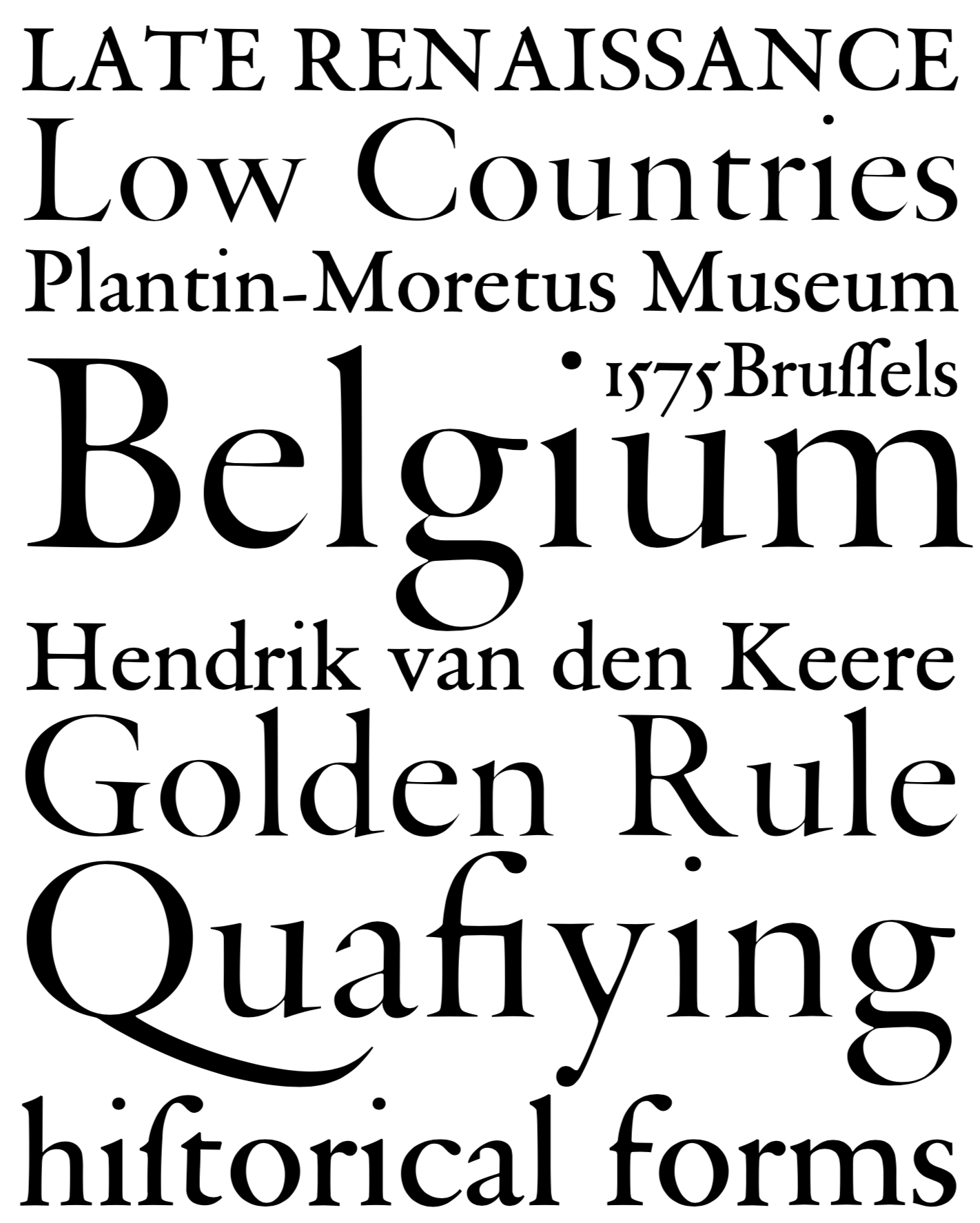
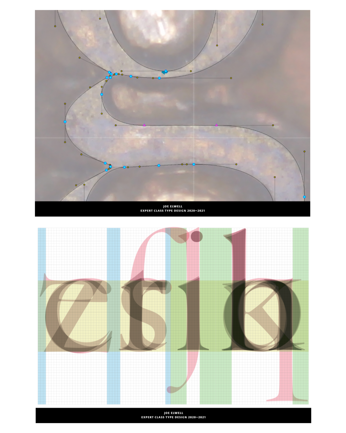
After metal type was cut and casted it had to be spaced to fit in the chase. Spacing was an integral part of the production process, and possibly the first aspect, not left to the end or fixed by kerning pairs as is done in font editors today. In order for the metal production process to be streamlined certain characters of similar structure were designed on the same width, what we call in modern terms, advanced width. Thus, when the original masters of the metal were literally digging out the a they would do so with the pre-knowledge of how wide (and tall) it needed to be. This was the same process for all characters. Glyphs like b, d, p, q, h, k, n, o, and u were all the cut to the same advanced width, side-bearing to side-bearing.